New app helps paint a clear picture of Covid pandemic in Scotland

Complex data on the spread of coronavirus across Scotland and its regions has been made simple thanks to an analyst at one of Edinburgh’s innovative technology companies based in the capital’s BioQuarter.
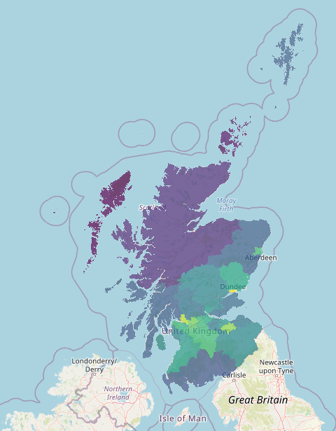
Bioinformatician Jack Sleight, of Fios Genomics, has built an app which translates daily data released by the Scottish Government into easy to read graphs, maps and charts.
Jack created The Covid Data Visualisation app, written in R using the Shiny package, to help people make sense of the daily facts and figures provided by Scottish Government and to help them gain a greater understanding about the spread of the pandemic across Scotland and its NHS regions.
“The aim was to summarise the public data through the use of neat, simple visuals and create something that is easy for people to use and get them more interested in how the pandemic is unfolding. The app can split the data into regional areas and the functional map also allows users to clearly see the national picture,” he said.
Fios Genomics is a specialist company delivering bioinformatics data services for pharmaceutical, bio-tech organisations and academia world-wide. The company is based at NINE, the incubator building in the £1bn BioQuarter health innovation district and is soon to expand into bigger premises due to rapid growth.
CEO Dr Sarah Lynagh says that demand for the company’s services has never been higher and believes basing the business at BioQuarter has played a part in its growth and success.
“It’s a brilliant and engaged community and it makes complete sense for a company such as Fios Genomics to be located in a life sciences hub so close to Scotland’s growing capital city. We are proud to support staff innovation and Jack’s app is an excellent tool that anyone can use to help make sense of the statistics that are so important to us all just now. Jack’s app demonstrates perfectly how applicable data analysis is in all our lives and we are currently recruiting new analysts like Jack to join our growing team during this exciting time for our business.”
David Ridd, Marketing Manager for Edinburgh BioQuarter, said: “It’s great to see Fios Genomics using their own time and resources to develop useful, free technologies for people across the country to use. Covid has shone a light on just how useful data is for public health but also how complex it can be to interpret. We’re also seeing very visible examples of data being used to design and develop new technologies and influence governmental policy. Thanks to innovators like Jack, and companies like Fios Genomics, BioQuarter is really well placed to contribute to the data-driven health opportunities which exist and help tackle future challenges head on.”
BioQuarter is one of Europe’s biggest mixed-use development opportunities combining pioneering health, science and technology businesses within an urban neighbourhood. With funding from the £1.3bn Edinburgh and South East Scotland City Region Deal, the new £68m Usher Institute building at BioQuarter is part of a programme of strategic asset development which will help to deliver the aims of the Data Driven Innovation Programme. It will make the shift for the Usher Institute from a virtual to a physical world-class innovation hub for health and social care.


